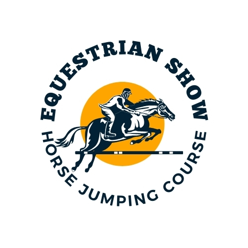
Are you ready to take the reins and trot into the world of equestrian branding? A unique & memorable logo can make all the difference when establishing a strong identity in the equestrian industry. Whether you’re running a riding school, equine therapy center, or a retail shop for horse supplies, your logo represents your brand’s essence.
In this blog post, we’ll guide you through everything you need to know about creating an exceptional equestrian logo. We’ll cover everything from understanding key elements to step-by-step design principles. By the end, you’ll be equipped with practical tips and inspiring examples to create a logo that captures the spirit of your equestrian business. Let’s get started!
The Importance of a Unique Logo in the Equestrian Industry
In the competitive world of equestrian businesses, standing out is crucial. A unique logo can set you apart from the herd, making your brand easily recognizable and memorable. It’s not just about aesthetics; a well-designed logo communicates professionalism, trust, and quality—key attributes that potential clients and customers look for.

Your logo serves as the face of your business. It’s often the first thing people see and remember about you. A distinctive equestrian logo can create a lasting impression, fostering loyalty and trust. Without a strong visual identity, your business might get lost in the crowded marketplace.
Furthermore, a unique logo helps in building brand consistency. It appears on all your marketing materials, from business cards & websites to social media profiles and merchandise. Consistency in branding strengthens your brand’s identity and ensures your message is clear and cohesive across all platforms.
Understanding the Key Elements of a Successful Equestrian Logo
Creating a successful equestrian logo involves more than just combining images of horses and riders. To truly capture the essence of your brand, consider incorporating these key elements:

Symbolism and Imagery
Horses, riding gear, and other equestrian symbols are integral to your logo. Choose imagery that resonates with your target audience and represents your business’s unique qualities. Whether it’s a sleek silhouette of a horse or a vintage stirrup, make sure the imagery is relevant and evocative.
Typography
The right font can speak volumes about your brand. Serif fonts often convey tradition and reliability, while sans-serif fonts can give a modern & clean look. Handwritten or script fonts add a personal touch and can evoke feelings of elegance and sophistication. Ensure your typography is legible and complements the overall design.
Color Scheme
Colors evoke emotions & can significantly impact how your brand is perceived. Earth tones like browns and greens can evoke feelings of nature and stability, while vibrant colors like reds and blues convey energy and professionalism. Stick to a cohesive color palette that aligns with your brand’s personality.
Step-by-Step Guide to Creating an Equestrian Logo
Ready to design your equestrian logo? Follow these step-by-step guidelines to create a logo that captures the spirit of your brand:

Step 1: Research and Inspiration
Start by researching your competitors & identifying what works well in their logos. Create a mood board with images, colors, & fonts that inspire you. This will help you visualize the direction of your design.
Step 2: Sketching and Conceptualizing
Put your ideas on paper. Sketch different concepts and variations. Don’t worry about perfection at this stage; focus on capturing the essence of your brand. Experiment with different layouts, symbols, and typography.
Step 3: Digital Design
Transfer your best sketches to a digital platform. Use design software like Adobe Illustrator or Canva to create a polished version of your logo. Play with colors, fonts, and shapes until you find the perfect combination.
Real-World Examples of Effective Equestrian Logos and Why They Work
Examining successful equestrian logos can provide valuable insights and inspiration for your design. Let’s look at a few examples:
Example 1: Classic Riding Academy
The Classic Riding Academy logo features a sleek horse silhouette and elegant serif typography. Using a single color palette with deep blue exudes professionalism and trust. This logo effectively communicates the academy’s long-standing tradition and high standards in equestrian training.
Example 2: Modern Equestrian Retail
This logo uses a minimalistic logo approach with a stylized horse head and modern sans-serif font. The bright color scheme adds a contemporary feel, appealing to a younger audience. The simplicity and clarity make it versatile for various marketing materials.
Example 3: Serenity Equine Therapy
The logo for Serenity Equine Therapy incorporates gentle curves and soft colors, evoking a sense of calm and healing. Combining a handwritten font with simple imagery of a horse’s head and a heart creates a warm and approachable brand identity.
Incorporating Your Logo into Your Equestrian Business
Once you have your logo, it’s time to incorporate it into your business. Here’s how to seamlessly integrate your new visual identity:
Branding Materials
Ensure your logo is featured on all branding materials, including business cards, letterheads, and signage. Consistency is key to building brand recognition.
Website and Social Media
Update your website & social media profiles with your new logo. Ensure it fits each platform’s specifications well and maintains its clarity and impact.
Merchandise and Promotional Items
Use your logo on merchandise like apparel, mugs, and tote bags. Promotional items with your logo can help spread brand awareness & create a sense of community among your customers.
Tips for Selecting the Right Logo Design
Choosing the right logo design is crucial for effectively representing your brand. Keep these tips in mind:
Reflect Your Brand’s Personality
Your logo should embody the personality and values of your brand. Whether traditional, modern, playful, or sophisticated, ensure the design aligns with your brand’s identity.
Keep It Simple
Simplicity is key to a memorable logo. Avoid cluttered designs & focus on creating a clean, straightforward, recognizable logo.
Test for Versatility
Ensure your logo looks good in different sizes & on various mediums. It should be versatile enough to be scaled down for a business card or enlarged for a billboard without losing impact.
Conclusion
Creating a stunning equestrian logo is an exciting and rewarding process that can significantly boost your brand’s visibility and appeal. You can make a logo representing your equestrian business by understanding the key elements, following a structured design process, and learning from real-world examples.
Ready to take the next step? If you need professional assistance bringing your vision to life, consider booking a call with one of our expert logo designers. Together, we can create a logo that captures the heart and soul of your brand. Happy designing!

Pingback: Crafting an Iconic Media Host Logo to Elevate Your Brand