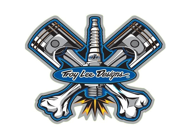
In the world of motocross and mountain biking, few names carry as much weight as Troy Lee Designs (TLD). This brand has become synonymous with high-performance gear and striking aesthetics that resonate with riders globally. At the heart of their branding lies a logo that is as dynamic and influential as the athletes who sport it. This blog post will take you on a visual and historical tour of the TLD logo, exploring its evolution, impact, and the design principles that make it memorable. By the end, you’ll gain insights into this iconic emblem and how you can create a compelling logo for your brand.
A Journey Through Time: The Evolution of the TLD Logo

Early Beginnings
The Troy Lee Designs logo has seen several iterations since its inception. The logo was simple yet effective in the early days, reflecting the brand’s focus on custom-painted helmets. The initial designs often featured bold typography and vibrant colors that captured the adventurous spirit of motocross.
Mid-2000s Transition
The logo underwent significant changes as the brand expanded into mountain biking and other action sports. The mid-2000s saw a more refined and streamlined version, incorporating sleek lines and modern fonts. This evolution mirrored the brand’s growth and increasing influence in the action sports community.
The Modern Era
Today, the TLD logo perfectly blends its historical elements and modern design trends. It features elegant typography and a distinctive emblem in any setting. This latest iteration reflects the brand’s commitment to innovation while honoring its storied past.
The TLD Logo’s Impact on Brand Identity and Consumer Perception
A Symbol of Quality
The Troy Lee Designs logo is more than just a visual marker; it symbolizes quality and performance. Athletes and enthusiasts associate the logo with top-notch gear that enhances their performance and safety. This strong consumer perception has been instrumental in building brand loyalty.
Marketing Powerhouse
The TLD logo is a central element in the brand’s marketing strategy, from print ads to social media campaigns. Its consistent use across various platforms ensures the brand remains top-of-mind for consumers. The logo’s recognizable design helps in creating cohesive and impactful marketing materials.
Merchandising Magic
The TLD logo is a staple on various merchandise, from helmets to hoodies. Its unique design makes it adaptable, allowing it to fit seamlessly on different products. This versatility boosts sales and enhances brand visibility in everyday settings.
Design Elements That Make the TLD Logo Iconic

Bold Typography
One of the standout features of the TLD logo is its bold typography. The font choice is both modern and timeless, making it easily recognizable. The clean lines & sharp edges add a touch of sophistication, aligning with the brand’s high-performance image.
Dynamic Colors
Color plays a crucial role in the TLD logo’s appeal. The brand often uses a combination of bright and contrasting colors to make the logo pop. These color choices reflect the energetic and adventurous spirit of the brand, resonating well with its target audience.
Symmetrical Balance
The TLD logo is a masterclass in symmetrical design. Every element is meticulously balanced, creating a sense of harmony and cohesion. This symmetry makes the logo pleasing to the eye and memorable, enhancing its effectiveness as a branding tool.
The Role of Logos in Brand Recognition
Instant Recognition
A well-designed logo can instantly make your brand recognizable, and the TLD logo is a prime example. Its distinctive design ensures that it stands out, even in crowded marketplaces. This instant recognition is invaluable for building a strong brand presence.
Emotional Connection
Logos can evoke emotions, and the TLD logo does this exceptionally well. For many riders, the logo represents passion, adventure, and community. By forging this emotional connection, the logo helps foster long-term consumer loyalty.
Competitive Edge
A strong logo can give you a significant edge in highly competitive industries like motocross and mountain biking. The TLD logo sets the brand apart from its competitors, reinforcing its position as a leader in the action sports market.
Creating a Memorable Logo for Your Business
Understand Your Audience
The first step in creating a memorable logo is understanding your target audience. TLD’s success can be attributed to its deep connection with the action sports community. By understanding your audience’s preferences and values, you can create a logo that resonates with them.
Keep It Simple
Simplicity is key when it comes to logo design. A simple logo is easier to recognize & remember. Despite its intricate design elements, the TLD logo maintains a level of simplicity that makes it effective. Focus on creating a clean, straightforward design that communicates your brand’s message.
Invest in Quality Design
A logo is an investment in your brand’s future. Don’t cut corners when it comes to design quality. Hire professional designers who understand the intricacies of logo creation. A well-crafted logo will pay off in the long run by enhancing your brand’s identity and market presence.
Conclusion
The Troy Lee Designs logo is more than just a visual asset; it’s a testament to the brand’s legacy, values, and vision. Its evolution from a simple emblem to an iconic symbol mirrors the brand’s growth and influence in the action sports world. The TLD logo serves as an exemplary case study for businesses looking to create a memorable logo. By understanding your audience, keeping the design simple, and investing in quality, you can create a logo that stands out & resonates deeply with your consumers.
Ready to explore more about logo design and brand identity? Please share your thoughts on the TLD logo and join our community of design enthusiasts!
